
|
 News
News
Cooking Up Character: 6 Rich Colors for Gourmet Kitchens
|
Subscribe to FREE newsletter
| Dec 17, 2020 |
Kitchens awash with color, including Tricorn Black SW 6258 (251-C1) in this St. Louis home, convey a warmth that feels particularly welcoming during the holidays.
As is the case for most of us, holiday gatherings this year look different for photographer Liz Sloan and her husband, Steve. The pandemic means the St. Louis couple will not host a sit-down dinner for upwards of 40 friends, a tradition that dates back to their previous home and its cramped kitchen. Nonetheless, large-scale entertaining remains a tradition at heart — and they know it will return. That’s why they’re glad they didn’t let the chance to buy a charming 1925 home “priced to put in your own kitchen” pass them by. “We didn’t want to pay for somebody else’s decisions,” Sloan says. It was the perfect scenario to put their stamp on the space.
Overhauling the kitchen’s awkward floor plan, including a large broom closet and disjointed breakfast room, was no easy feat. But interior designer Kim Taylor West embraced the challenge, going so far as to elevate the look of existing historical features such as radiators and tall windows with paint. “If you keep your key architectural elements historically correct — and try not to change them other than updating them with paint — you can bring in more modern and transitional pieces that make the whole house work,” West says.
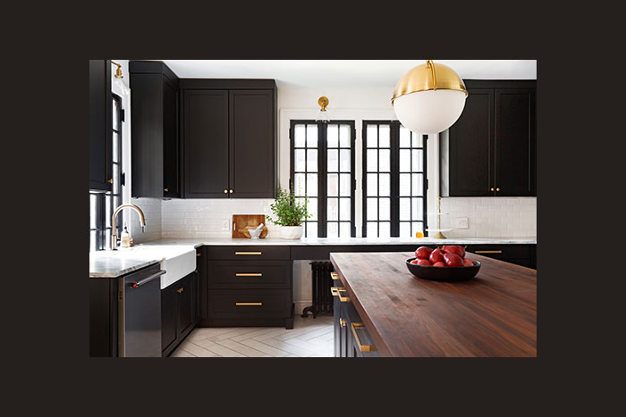
Cabinets, windows and radiators painted with Duration Home® Interior Acrylic Latex in Tricorn Black SW 6258 (251-C1) balance the kitchen’s otherwise primarily pale surfaces, including the porcelain tile floor. “I don’t think the black cabinets would have worked as well with a dark wood floor,” designer Kim Taylor West says. “There’s a good balance of light and dark in this house.”
West selected that same paint color, Tricorn Black SW 6258 (251-C1), for the kitchen’s cabinets, making it one of the kitchen’s defining features. “Tricorn Black is a favorite of mine,” she says of the color, which is also in the Sherwin-Williams 2021 Colormix® Tapestry palette. “One of the first things we presented to Liz was painting the new cabinets that color and explaining why it would be fabulous, and she absolutely loved it.”
Inspired in part by Sloan’s favorite jewelry pieces, including black-and-gold earrings in a geometric art deco style and wooden bracelets with a 1970s feel, West and her team gradually pieced together the rest of the room’s palette of brushed gold light fixtures and cabinet hardware; reclaimed barn wood floating shelves; a ceramic floor tile arranged in a chevron pattern for a more elegant look; stainless-steel appliances; and walnut butcher block and marble countertops.
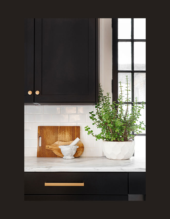
Cabinet hardware in a brushed-gold finish pops against the Tricorn Black cabinets. “We were very picky on the hardware,” West says. “We liked how the knobs and flat pulls had a modern look and some weight to them.”
But the room’s pièce de résistance is the book-matched marble spanning the entire range wall. “You can’t have too many ‘wow’ factors,” West says. “You just need to have one signature feature for each room.” And this is it.
Considerable effort went into choosing the right level of marble veining — in a medium gray that’s not too strong, not too pale — and coordinating the peak of the pattern with the shape of the range hood. “It was tricky and a big deal to get right,” West says. “We only had enough of the slabs to get that cut and install it once.”
The effort was worth it. “After the kitchen was complete, I told Kim that I felt like I was staying at an Airbnb on vacation, with a perfect kitchen,” Sloan says. “I firmly believe that the things we use every day should feel special.” (She loves the space so much that during the pandemic, she used it as home base to co-launch an entertaining blog, prettytogether.com.)
The same belief applies to every time of the year, as well. “The warm palette looks great for the holidays,” West says. “But it’s beautiful with fresh vegetables from the garden in summertime, too.”
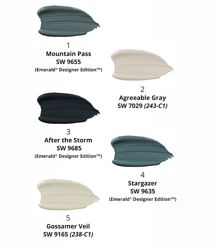
Color in the Kitchen: Sue Wadden’s Top 5
Sherwin-Williams Director of Color Marketing Sue Wadden loves kitchens rich with color. And the right choice can be a refreshing — yet timeless — alternative to white. Here are five of her top paint color picks for this important space.
Photos by Liz Sloan
@SWDesignPros #SWDesignPros #color
For other relevant searches, you might want to try: