
|
 News
News
Dive Into the Collection: Color and Nature’s Effect on Mood
|
Subscribe to FREE newsletter
| Jan 18, 2021 |
Color has a huge impact on well-being and keeping our lives in balance. See what I mean in the new Living Well™ collection from Sherwin-Williams.
By Sue Wadden, director of color marketing
Simplicity and clarity in color and design may, at first, seem like natural outgrowths of what we want from our homes right now. Calm. Refuge. Rejuvenation. And while, in a sense, it’s true that the COVID-19 world has led us to a collective “reset” of sorts, these qualities also tie to the idea of living well. It’s something my team and I have been talking about for quite some time, way before the pandemic. You’ve seen it through the stories of well-being and color in balance we shared in both our 2020 and 2021 Colormix® Color Forecasts. And now it comes to beautiful life in our brand-new Living Well collection.
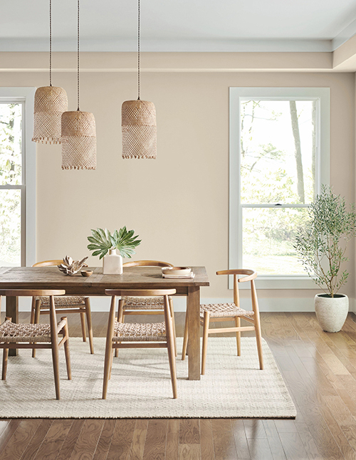
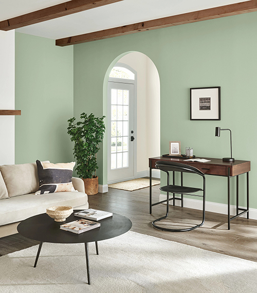
The Living Well collection includes warm neutrals such as the Balance palette’s Accessible Beige SW 7036 (249-C1), shown in the dining room, above, and cool hues such as the Focus palette’s Morning Fog SW 6255 (234-C3) in the home office, top.
From a design standpoint, the Living Well collection is less about color psychology and more about mood — how color and the principle of biophilia (bringing nature inside) can benefit your well-being. So I asked myself: What are the most restorative colors? What are the colors for relaxation? That inspire creativity? That encourage focus?
Answering questions like these informed the development of 11 palettes that would support each mood and story. The palettes live somewhat independently of one another, whether it’s to reflect or focus, create or unwind. But together, they support this overarching movement of living well.
Woodland-inspired greens from the Balance palette include Cascade Green SW 0066.
All of the colors, pulled from our ColorSnap® system, live within a light- to mid-tone zone that’s a real sweet spot. They’re incredibly usable and adaptable. And the palettes themselves provide helpful guidance on complementary hues.
But one of my favorite things about Living Well is that it’s not just about color. It’s about the innovative science behind our products. You can read more about the benefits of SuperPaint® Interior Latex with Sanitizing Technology and SuperPaint® Interior Latex with Air Purifying Technology from my colleague and our resident scientist at Sherwin-Williams, Rick Watson, in this quick Q&A.
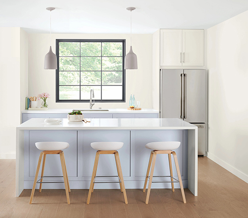
The Create palette includes energetic colors such as Daydream SW 6541 (187-C2), shown on this kitchen’s cabinets, and First Star SW 7646 (256-C6), shown on the walls.
With all of this exciting news, it’s so hard to pick a favorite palette from this collection. So here’s what I like, and what I think you’ll want to know, about each.
Balance is about the combination of warm and cool neutrals balanced with earthy greens. This palette really embodies the principle of biophilia — tones with a nod to nature.
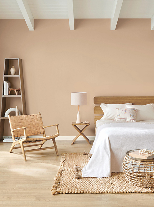
Breathe is about warmth, so you see warm, sandy neutrals with color combinations conducive to the feeling you get from yoga, meditation and rest.
Center speaks to a meditative quality, as well. Its restorative hues with purple and taupe undertones work remarkably well for a range of looks.
Create is our most playful palette. It’s about having fun and living in a creative environment. Yet these colors aren’t overly dramatic. They’re still thoughtful and carefully curated.
Focus provides us with cooler neutrals — so blues and greens — with the idea of removing distractions and creating opportunity for focus.
Inspire is another palette that gets at the idea of play. Here I wanted to work in a sort of mid-century vibe with soft teals and apricots. When envisioning this palette, my mind went to Palm Springs.
Recharge is all about those watery tones, including restorative blues. Picture what’s to love in a lake house.
Reflect has these soothing, airy, wondrous white tones. Think meditation and spirituality, and the ethereal colors associated with those.
Renew is all about warmer, classic neutrals, but balanced with undertones of pink and green. It’s luxurious and upscale, but with a more modern interpretation.
Unplug was inspired by desert hues. Here I saw nature in a subdued way. So, for example, we’re talking about softer expressions of green, rather than rich evergreens.
Unwind is a very natural palette — one that’s rooted in the earth. It’s almost like a walk through a forested landscape, with beautiful silvers, blues and greens.
But don’t just take my word for it! Check out the Living Well palettes for yourself and see what might inspire your next project.
The desert-inspired Unplug palette includes Practical Beige SW 6100 (201-C2).
Photography creative by Britton Marketing & Design. Styling by Christina Wressell.
@SWDesignPros #SWDesignPros #color
For other relevant searches, you might want to try: